Bus station pavilion: A marriage of design and manufacture
Architectural design studio and boatbuilder cooperate to make this passenger terminal "first" a first-class showpiece.
As more architects learn about composites and dabble with their application in building and construction, composites fabricators the world over will increasingly face the sometimes daunting task of turning a creative design into a real, feasible and manufacturable structure. Doing so requires teaching, additional creativity, adaptability and trial and error.
Such was the case at the Union Station bus terminal in Washington, D.C., when the decision was made in 2011 to remake the many-years-old — and drab — passenger concourse into a modern, inviting, accessible and efficient space that would help guide passengers from one mode of transport to another.
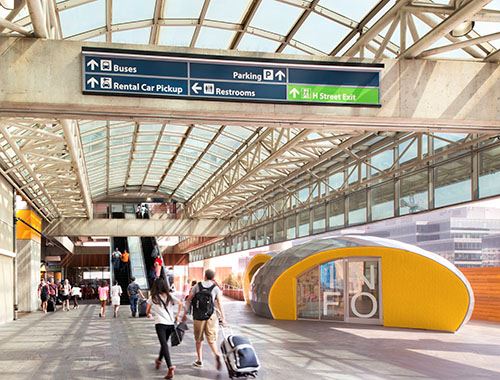
The centerpiece of the Union Station renovation is a silver and bright yellow ticketing and information pavilion on the concourse. It weds ultracreative structural design with a composites manufacturing strategy that drew, incongruously, on lessons learned from years of traditional boatbuilding methods adapted for this new application. The result is not only a refreshed bus terminal concourse, but also an emerging iconic symbol that marks arrivals and departures for thousands of Washington, D.C., travelers.
Buses and more buses
Union Station, located just north of the U.S. Capitol, began operation as a train station in 1907 and grew quickly to become the city’s transportation hub. Its neoclassical design was a hallmark of Washington, D.C., architecture for decades. However, competing transport options — cars and airplanes — eventually diminished the station’s standing. In the 1970s, a parking garage was attached to the north end of the station, over the train tracks, with a utilitarian design that featured liberal use of concrete, as might be expected in a parking structure. In the 1980s, the U.S. government renovated the building and made it, once again, a centerpiece of rail transportation and local commerce.
Meanwhile, after decades of steadily declining interest, cost-conscious travelers who were wary of flying and disinterested in driving rediscovered the benefits of intercity bus travel. Indeed, since 2006, intercity ridership has increased each year, spawning new operators, new routes and new amenities. Greyhound, BoltBus, Coach USA, Megabus and others saw passenger traffic increase 7.5 percent from 2011 to 2012, the largest increase among all modes of travel.
Many intercity bus operators still deposit and pick up passengers at various locations from city to city, often at designated curbside locations where shelter, amenities and information are usually scarce. For travelers, this occasionally makes bus travel tenuous and uncertain.
Faced with this haphazard approach to intercity bus arrivals and departures in Washington, D.C., the Union Station Redevelopment Corp. (USRC) decided in 2010 that it would consolidate all intercity travel activity on the second level of the station’s parking garage. This would place all of D.C.’s intercity bus and rail service at a central, enclosed location, increasing passenger convenience. This would require new information, ticketing and passenger-waiting facilities for bus passengers. The perfect location for these amenities would be the passenger concourse that connects the original structure with the parking garage, a large area bisected by escalators and partially exposed to the elements. The trick, then, was to transform this concrete landscape into an inviting passenger transit area.
Enter the architect
USRC contracted with Studio Twenty Seven Architecture (S27, Washington, D.C.) to design bathrooms, a concourse waiting area and a ticket and information pavilion. Todd Ray, one of the principals of S27, says his firm developed several design options for the space, with much of the design variation focused on the location, size and shape of the pavilion. The long, narrow concourse would limit the structure’s size, yet whatever was developed would have to be accessible, inviting and able to withstand exposure to sun, wind, rain and snow. And it would have to be designed and constructed quickly; the design work started in February 2012, and the finished pavilion was to be installed in May of this year.
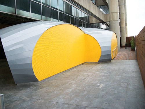
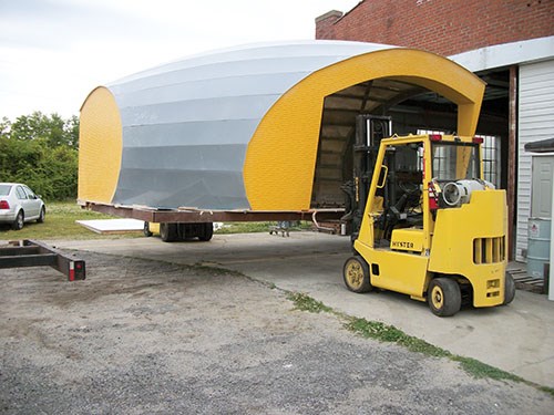
Ray says USRC latched on to a “twin pavilion design” that joined two ovoid structures into a single “Booleaned ellipsoid” (see the photos on this spread). It was decided that the unusual shapes would be fabricated in strips or peels. The conjoined structures, gel coated yellow and silver, would feature what Ray calls a “collapsing of skin,” where arched roof panels placed over a skeletal frame would slope to the ground and become the pavilion’s walls. Each pavilion would feature an entrance for easy access by bus passengers.
The question was, What materials should be used? At first, metals were considered, but cost considerations steered the architect toward a mix of metals and nonmetals. Then, says Ray, in conversations with the project’s contractor, Monarc Construction Inc. (Falls Church, Va.), the pavilion’s curved structure suggested the possibility of turning to a boatbuilder, and that’s when composites entered the picture. Several boatbuilders were evaluated for the project before S27 and Monarc chose Compmillennia LLC (Washington, N.C.), led by general manager Jim Gardiner. With a long history of manufacturing composite yachts, Gardiner saw the ellipsoid pavilion as an inverted boat hull — albeit one with some significant variations.
“We’d never used composites before,” Ray recalls. “This was totally new for us, but it was an enjoyable learning curve.”
Balancing ideal and real
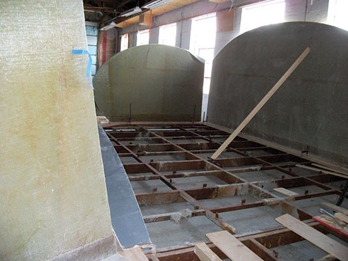
The first task, says Gardiner, was for Compmillennia to assess the design and make two critical judgments about project feasibility, in regard to manufacturability and cost. Compmillennia was aided in this effort by Eric Greene Associates (Annapolis, Md.), which performed wind/snow load analysis on the pavilion and provided composite design help. The original design, he says, came in as two separate pavilions, one the inverse of the other, but each expected to come from the same mold. This concept proved prohibitively expensive, so the plans were modified. After further cost evaluation, balanced against square footage requirements, S27 decided to alter the design further by slicing the ovoid shapes vertically to create a flat, textured wall at each entrance of the pavilion and along its back wall. Gardiner says the resulting design looked like a “zeppelin with the ends sliced off.” These vertical walls, it turned out, would prove to be the most challenging aspect of the project.
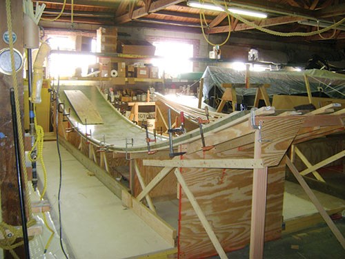
Another challenge was the arched roof and wall system. Given the inverted-hull look, Gardiner suggested the use of a slip mold, on which a section of the structure is molded and moved or “slipped” off the mold so that the next section can be molded. Ray and S27, however, sought a roof that consisted of a series of interlocking flat, narrow panels arching across the length of each pavilion segment.
“The difference between the monolithic versus the segmented roof evolved based on cost modeling of systems,” Ray says. “The segmented scheme could be made from a few templates/formworks and clipped together. In addition, the seams added a sense of scale to the structure thus making it more visually measured and comprehensible to the passer-by.”
Finally, there was the question of time. Compmillennia initially had 72 days to build the pavilion, but paperwork delays trimmed the production window to 32 days. Gardiner recalls. “I was told by the general contractor that if the pavilion was not delivered on the date it was due, don’t bother bringing it up.”
Morse code meets fiberglass
First, Compmillennia attacked the flat wall panels. On the original design, says Gardiner, they featured a texture that resembled the surface of water. Then, says Ray, Studio Twenty Seven shifted gears, seeking a more iconic and meaningful design that conveyed a message. “We wanted something less random, something imbued with meaning,” Ray remembers.
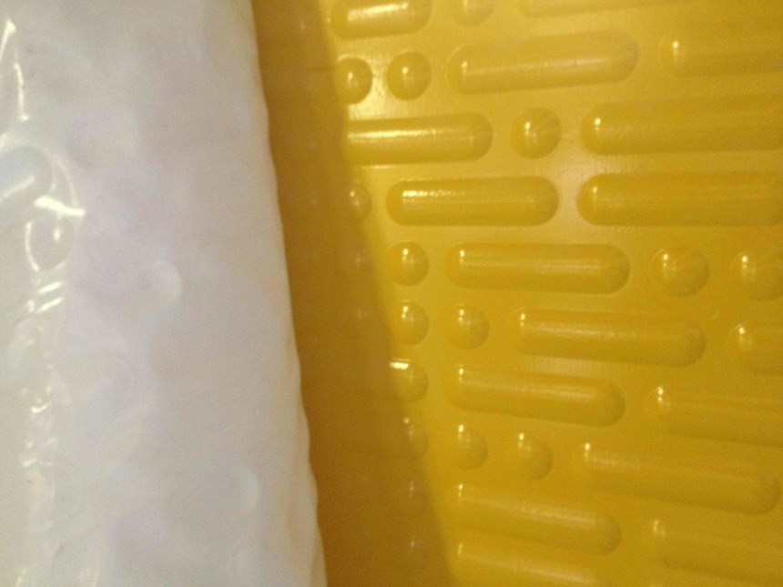
“The real fun started with the end walls,” says Gardiner. “At first, it looked like splashes of water on a panel. Then they came through with the Morse code.” Indeed, S27 decided to etch on the panels, in Morse code, lyrics from a song by the group Death Cab for Cutie, called “Soul Meets Body.” The lyrics of interest, says Ray, convey the sense of impermanence and transience that is a bus depot:
’Cause in my head there’s a Greyhound Station
Where I send my thoughts to far off destinations
So they may have a chance of finding a place
Where they’re far more suited than here
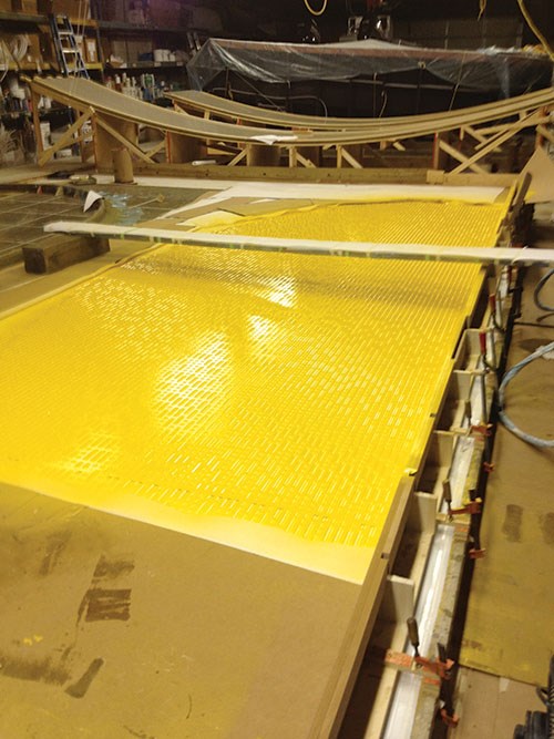
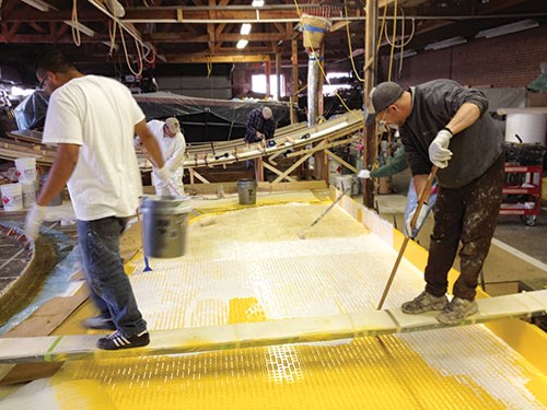
The coded lyrics were routered by signage fabricator Smart Design Inc. (Woodbridge, Va.) into several sheets of 4-ft by 10-ft (1.2m by 3m) medium-density fiberboard (MDF). Six sheets were then laid out and pieced together into a big 10-ft by 24-ft (3m by 7.3m) panel. The trick, says Gardiner, was to get gel coat into the Morse code dimples in the MDF without destroying the tool or the part. “Maybe it’s been done before,” says Gardiner, “but I hadn’t seen it, so we had to make it up.”
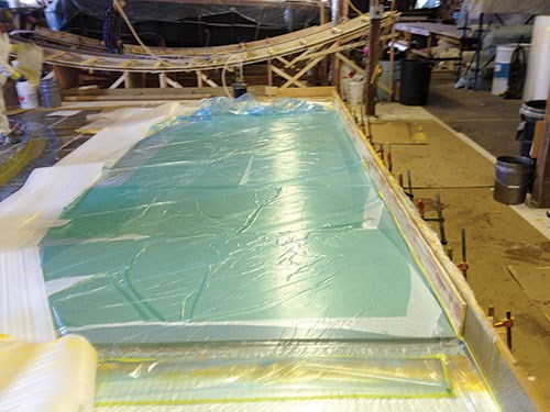
MDF is porous, so a film was required to coat the tool surface, hold the vacuum while it was sucked into contact with the routered design and then release the finished part afterward. Gardiner turned to a marine-industry staple for a solution: the white plastic wrap used to cover boats for protection from weather. This 6-mil thick plastic film, Gardiner says, responded well to the vacuum and conformed well to the Morse code dimples.
Compmillennia covered the entire tool with this film and then pulled a vacuum on a section of its 20-ft by 80-ft (6m by 24.4m) vacuum mold table to about 100 millibars (22 to 25 inches Hg) absolute pressure.
“This was a high-risk strategy,” Gardiner reports, “because if you lose the vacuum, you lose the part.” Testing, however, revealed that it could work.
With a tooling strategy in place, the next step was to spec the gel coat. S27 had specified a custom yellow color that had to be matched exactly. This yellow, it turned out, is the same color as the paint used for parking lot lines — more symbolism from the parking structure. Working with HK Research Corp. (Hickory, N.C.), Compmillennia developed a yellow gel coat that won approval. A release agent was sprayed over the MDF tool after the plastic film was placed, mold plants for windows and doors were placed, and then the gel coat was applied at a thickness of 18 to 22 mils. This was followed by application of ATC Scott Bader’s (Burlington, Ontario, Canada) Poly-Bond B55LV, a polyester-based material that was squeegeed into the Morse code dimples to create a flat surface on which the rest of the panel structure could be placed. From there, fabrication of the panels was relatively simple. Stacks of fiberglass and resin were added to build the structure’s final 1.625-inch/41-mm thickness. The laminate included the following materials, in this order:
• 1.5-oz chopped strand mat (CSM) from Owens Corning
(OC, Toledo, Ohio)
• Fire-resistant K130-PTJ-20 polyester resin from AOC LLC
(Collierville, Tenn.), hand rolled at ambient temperature
and cured for four hours
• 1.5-oz CSM (OC)
• E-LT 3200 0/90 stitched biaxial E-glass fabric from
Vectorply (Phenix City, Ala.)
• K130-PTJ-20 polyester resin (AOC)
• 30-mm/1.2-inch Divinycell polyvinyl chloride (PVC) foam
core from DIAB Sales Inc. (DeSoto, Texas)
• 1.5-oz CSM (OC)
• E-LT 3200 0/90 stitched biaxial E-glass (Vectorply)
• K130-PTJ-20 polyester (AOC)
Compmillennia finished the panel with a 7-inch/178-mm wide flange along what would be the wall’s base to provide attachment points for securing the pavilion to the concourse floor during installation. Gardiner says that because it was so large, the entire panel was kept on the heated mold table under an insulation blanket as long as possible, and at as consistent a temperature as possible, to avoid warping.
Panels and skeleton
As attention turned to the pavilion roofing system, the challenge centered on the fact that each panel, because of its location and length, has unique dimensions. Each panel, therefore, had to be built to a different specification for its location in a particular place on the pavilion.
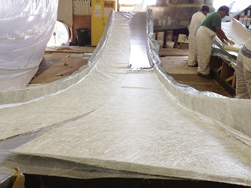
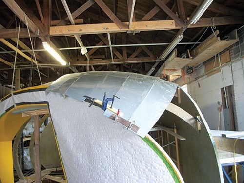
Fabrication of the panels relied on a tried-and-true method, namely lofting full-size patterns. Digital files of the panels were sent by S27 to Compmillennia, which used the files to cut panel patterns from long sections of floor paper. These paper patterns were placed on a mold and used as a guide for material placement. The stack for each 0.25-inch/6mm thick panel includes a clear gel coat and a dark silver gel coat (both provided by HK Research), a 1.5-oz CSM (OC), two layers of E-LT 3200 0/90 stitched biaxial E-glass (Vectorply), and K130-PTJ-20 polyester (AOC). Each panel is flanged along one edge to provide a mating surface for the adjacent panel. (“We wanted flanges on each edge,” Gardiner says, “but we didn’t have time to do that.”) Gardiner says Compmillennia could produce one large panel or multiple smaller panels per day from each of the two molds manufactured for the job.
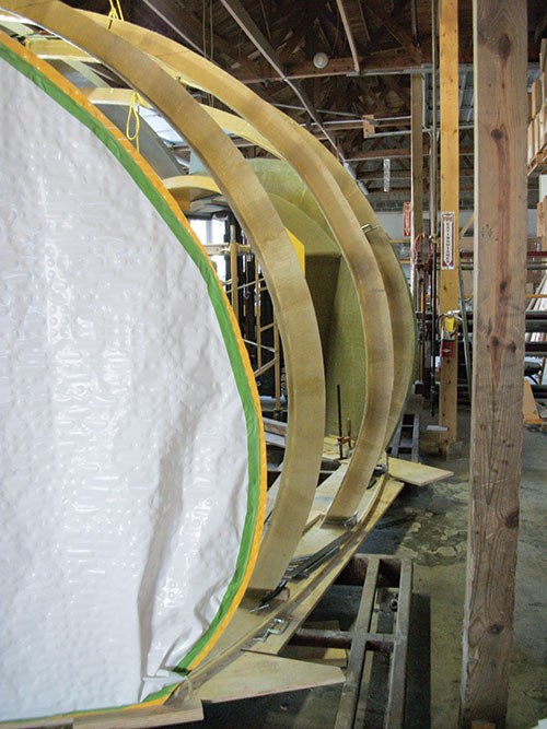
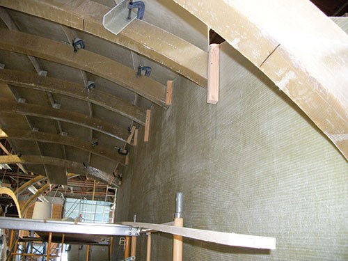
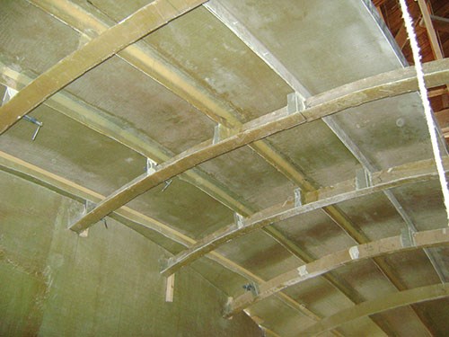
Eventually, the panels were draped over and bonded to a fiberglass skeleton consisting of a series of L-shaped ribs that formed arches from one side of the pavilion to the other. Some of the ribs were attached to the yellow end walls, and others continued down to the groundsill plate. Each rib features a 4-inch/102-mm web abutting a 3-inch/76-mm flange, all fabricated by hand with four layers of Vectorply’s E-LT 3200 E-glass and OC’s K130-PTJ-20 polyester. The flange on each panel intersects a rib at a 90° angle and is attached via adhesive with an L-shaped fiberglass fixture. Joints between each roof panel were secondarily bonded with Vectorply’s E-BX-2400 fiberglass. Seams between the panels were sealed with architectural-grade caulk to keep out moisture and other elements.
Installation
The pavilion was fabricated in two sections at Compmillennia’s plant in Washington, N.C., and shipped by Deep Water Transport Enterprises Inc. (Washington, N.C.) via flatbed truck to Washington, D.C., for installation at Union Station. Because the station is heavily used, and because of limits imposed by other ongoing work in the garage, there was a very narrow window in which Compmillennia could deliver and install the pavilion: the night of May 1, 2013.
Gardiner supervised the effort and says the structures’ low mass made them relatively easy to unload, move and position on the concourse (see endnote). The next several days were spent bonding and securing the halves of the pavilion together, anchoring the pavilion to the floor, installing doors and prepping the structure for internal finishing.
Looking back, Gardiner and Ray agree that cooperation between Compmillennia and S27 was the key, supported by constant and well-coordinated communication. “We kept FedEx pretty busy,” quips Ray. As a result, his firm’s first brush with composite materials was a good one, with valuable lessons learned about fabrication, form possibilities, textures and material variations. Gardiner confirms that S27 was highly adaptable as it worked with composites and learned quickly what the material could and could not do. “The architects were professional, creative and supportive,” Gardiner reports. “They were the key player in this project. They really drove materials use,” he concludes.
As CT went to press, a construction crew was finishing the pavilion’s interior. Two-thirds of the structure will soon be used by Greyhound bus line for ticket sales and information; one-third will house a retail outlet for Washington, D.C.’s Cultural Tourism agency. And bus travelers? They’ll no doubt see the visually arresting pavilion as a familiar sign that they’ve arrived — or are about to depart.
Video coverage of the pavilion installation can be viewed at http://www.youtube.com/watch?v=MyQDmIGnx0Y&feature=youtu.be.
Related Content
PEEK vs. PEKK vs. PAEK and continuous compression molding
Suppliers of thermoplastics and carbon fiber chime in regarding PEEK vs. PEKK, and now PAEK, as well as in-situ consolidation — the supply chain for thermoplastic tape composites continues to evolve.
Read MoreThe potential for thermoplastic composite nacelles
Collins Aerospace draws on global team, decades of experience to demonstrate large, curved AFP and welded structures for the next generation of aircraft.
Read MorePultrusion: The basics
A primer describing what pultrusion is, its advantages and disadvantages, and typical applications.
Read MorePlant tour: Albany Engineered Composites, Rochester, N.H., U.S.
Efficient, high-quality, well-controlled composites manufacturing at volume is the mantra for this 3D weaving specialist.
Read MoreRead Next
All-recycled, needle-punched nonwoven CFRP slashes carbon footprint of Formula 2 seat
Dallara and Tenowo collaborate to produce a race-ready Formula 2 seat using recycled carbon fiber, reducing CO2 emissions by 97.5% compared to virgin materials.
Read MoreDeveloping bonded composite repair for ships, offshore units
Bureau Veritas and industry partners issue guidelines and pave the way for certification via StrengthBond Offshore project.
Read More“Structured air” TPS safeguards composite structures
Powered by an 85% air/15% pure polyimide aerogel, Blueshift’s novel material system protects structures during transient thermal events from -200°C to beyond 2400°C for rockets, battery boxes and more.
Read More







.jpg;maxWidth=300;quality=90)


